In the pursuit of looking modern, have brands forgotten what makes them recognizable?
Why Does Every Rebrand Look Like Every Other Rebrand?


TL;DR
Somewhere along the way, modernizing a brand started to mean making it look like every other modern brand. Distinctive logos became minimalist wordmarks. Personality gave way to polish. And brands with decades of recognizable character traded it all for the same tasteful typography.
But a successful rebrand isn’t about following design trends. It’s about understanding which parts of your identity make you distinctive, which are holding you back, and how to evolve without becoming unrecognizable.
Welcome to the Great Brand Blanding
Picture a luxury fashion logo.
Black. All caps. Sans-serif font. Generous spacing. Probably sitting on a white background.
Got it?
Great. Which brand were you picturing?
Exactly.
For years, brands have been stripping away the visual details that once made them distinctive in the name of modernization. Elaborate logos have been replaced with clean typography. Illustrations have disappeared. Character has been exchanged for simplicity.
And somehow, a remarkable number of very different brands have arrived at almost exactly the same place.
The phenomenon even has a name: blanding.
It’s particularly noticeable in luxury fashion, where brands like Burberry, Balenciaga, Balmain and Saint Laurent embraced variations of minimalist typography throughout the 2010s.
But it extends well beyond fashion.
Across industries, brands have adopted remarkably similar interpretations of what contemporary design should look like: restrained colour palettes, geometric typography, simplified symbols and an abundance of white space.
To be fair, there are good reasons for some of these choices.
Brands need to work across more environments than ever. Logos must remain legible on tiny screens. Visual identities need to scale across digital platforms, packaging, physical spaces and everything in between.
Simplicity can be an enormous asset.
But somewhere between making brands easier to recognize and making them easier to reproduce, we may have confused simplicity with sameness.
And those are two very different things.
How Did We Get Here?
Nobody sets out to make their brand look generic.
Usually, the conversation starts with perfectly reasonable ambitions.
“We want to look more contemporary.”
“We need to appeal to a younger audience.”
“Our identity needs to work better digitally.”
“We want something more sophisticated.”
All legitimate goals.
The trouble starts when those ambitions are translated into visual conventions rather than meaningful brand decisions.
Contemporary becomes minimalist.
Sophisticated becomes restrained.
Premium becomes monochromatic.
Digital-first becomes simplified.
And before you know it, a brand with a perfectly interesting history and personality is wearing the visual equivalent of a black turtleneck.
Very tasteful. Very safe. Possibly indistinguishable from six competitors.
The problem isn’t that minimalism is bad design. Some of the world’s most recognizable brands have extraordinarily simple identities.
The problem is that design trends are not brand strategies.
A visual identity should communicate something distinctive about the organization behind it.
When brands borrow the same visual cues to communicate the same generic qualities, they’re not necessarily becoming more relevant.
They’re becoming more alike.
When Modernization Removes the Things People Remember
There’s a useful distinction between making a brand look current and making a brand look different.
And there are some fascinating examples of what happens when brands navigate that distinction.
Burberry: Sometimes the Way Forward Is Back
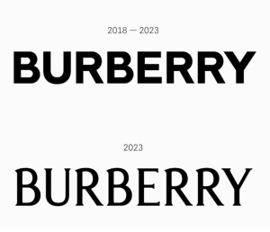
In 2018, Burberry introduced a bold, sans-serif wordmark designed by Peter Saville, replacing its previous serif typography.
It was clean, confident and unmistakably contemporary.
It also looked rather similar to the direction much of the luxury fashion industry was taking.
Burberry wasn’t alone. Across the category, fashion houses with wildly different histories were adopting increasingly similar visual languages.
Then, in 2023, Burberry changed direction.
Under creative director Daniel Lee, the brand introduced an archive-inspired serif wordmark and brought its historic Equestrian Knight Design back into greater prominence.
The identity felt unmistakably connected to Burberry’s British heritage.
The interesting thing about this evolution isn’t that the serif version is inherently better.
It’s that the brand rediscovered the value of its own history as a source of differentiation.
The distinctive details that once might have felt old-fashioned suddenly became valuable precisely because they were uniquely Burberry.
Modernity didn’t require abandoning the past.
It required deciding which parts of the past were worth bringing forward.
Burger King: Simplifying Without Losing Your Personality
Burger King’s 2021 rebrand offers a different lesson.
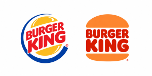
The brand replaced its glossy, tilted, blue-accented logo from 1999 with a flatter, simpler design inspired by its identity from the late 1960s and 1990s.
Technically, the new logo was more minimalist.
But it was also more expressive.
The rounded typography, warm colours and recognizable burger-bun shape made the brand feel playful, approachable and unmistakably connected to food.
The broader identity introduced custom typography, illustration, photography and packaging that reinforced the same personality.
Rather than stripping away its character to look contemporary, Burger King used contemporary design principles to bring that character forward. And that’s an important distinction.
Simplification doesn’t have to mean subtraction of personality.
Sometimes it means removing the things that distract from it.
The Trouble With Designing for Approval
Here’s another reason so many rebrands end up looking similar.
Familiar design choices are easier to approve.
A clean wordmark is unlikely to offend anyone.
A restrained colour palette feels sophisticated.
Minimalist typography is easy to defend with references to other successful brands.
In a room full of stakeholders, these choices can feel reassuringly low-risk.
But there’s a contradiction here.
Most organizations begin a rebrand because they want to become more distinctive, relevant or recognizable.
Then they evaluate the proposed identities against what feels familiar and acceptable.
The more unusual the design, the more explanation it requires.
The more familiar the design, the easier it is to approve.
And slowly, the interesting options disappear.
This doesn’t mean every bold design direction deserves approval. Distinctive is not automatically good, and strange isn’t a strategy.
But it does mean that brand leaders need to recognize the difference between something that feels wrong for the brand and something that simply feels unfamiliar.
The purpose of a rebrand isn’t to create the identity everyone in the meeting likes best.
It’s to build the identity that best represents the brand and connects with the people it’s trying to reach.
Those aren’t always the same thing.
Your Brand’s Quirks Might Be Its Greatest Assets
There’s something wonderfully irrational about how people develop affection for brands.
We recognize particular colours. We remember unusual shapes. We associate certain characters, sounds, phrases and visual styles with experiences we’ve had over time.
These associations are rarely the result of a conscious evaluation of design quality.
They’re learned through familiarity.
Over time, seemingly small details become part of how we recognize and remember a brand.
And sometimes those details are objectively a little strange.
A peculiar mascot. An unusual typeface. A colour combination that shouldn’t work but somehow does. A logo that’s slightly awkward, yet immediately recognizable.
These are exactly the elements a redesign might identify as dated, inconsistent or unnecessarily complicated.
But from the audience’s perspective, they might be the most valuable things the brand owns.
Consider the challenge for a brand design agency: how do you distinguish between a visual element that’s genuinely holding the brand back and one that’s building recognition?
The answer can’t come from aesthetic preference alone.
It requires understanding what people already associate with the brand.
Because a recognizable identity has something a completely new identity doesn’t: memory.
And memory takes time and investment to build.
The JK Take: A Successful Rebrand Should Make You Look More Like Yourself, Not More Like Everyone Else.
A rebrand is an opportunity to clarify who you are.
Not an invitation to become whoever happens to be fashionable.
The strongest brand identities don’t simply reflect contemporary design standards. They express a clear point of view about the business, its audience and what makes it different.
That might mean embracing minimalism.
It might mean leaning into heritage.
It might mean introducing something completely unexpected.
But the decision should begin with the brand itself, not a mood board of what everyone else is doing.
This is where the relationship between brand strategy and brand design becomes particularly important.
Brand strategy defines what the organization stands for, who it needs to connect with and what makes it meaningfully different.
Brand design makes those choices recognizable.
Without that foundation, design becomes an exercise in aesthetics.
And aesthetics are remarkably easy to imitate.
The best rebrands don’t just look good. They look like they could only belong to one brand.
How to Modernize a Brand Without Making It Generic
If you’re considering a rebrand, the question shouldn’t simply be what needs to change.
It should also be what deserves to stay.
Here are five places to start.
1. Audit Recognition Before You Redesign
Before removing or replacing existing brand elements, understand which ones people actually recognize.
Look beyond the logo.
Consider colours, typography, imagery, shapes, characters, packaging, tone of voice and other distinctive assets.
Which elements do people associate with your brand?
Which help you stand out in your category?
Which have genuine meaning for your customers?
Don’t assume something has no value because it looks dated to your internal team.
2. Define What Modernization Actually Means
If the brief says “make us look more modern,” ask what problem that’s supposed to solve.
Is the brand struggling to connect with a younger audience?
Does the identity feel disconnected from the company’s current positioning?
Is the design system difficult to use across digital channels?
Does the brand lack credibility in a changing category?
Each problem might require a different solution.
And not all of them require a new logo.
3. Study Your Competitors Before Following the Trend
Put your identity beside those of your competitors.
Remove the names, if you can.
What do you notice?
If everyone uses similar typography, colours, layouts and imagery, adopting those same conventions may make your brand feel familiar without making it memorable.
Look for opportunities to create meaningful contrast.
The goal isn’t to be different for the sake of it.
It’s to make your brand easier to identify and remember.
4. Separate Distinctive Assets From Outdated Execution
An existing brand element may be valuable even when its execution needs improvement.
A recognizable symbol can be simplified.
An unusual typeface can be refined.
A familiar colour palette can be expanded.
A longstanding character can be reimagined.
The choice isn’t always between keeping everything and starting over.
Often, the most effective work comes from identifying what makes the brand recognizable and finding a better way to express it.
5. Judge the Identity in the Real World
A logo can look beautiful in a presentation and disappear completely in the market.
Evaluate your identity where people will actually encounter it.
On a crowded shelf. In a social feed. On a mobile screen. Beside competitors. On signage. In advertising.
And consider the broader system, not just the logo.
Does the identity make the brand recognizable without the name?
Does it communicate the intended personality?
Can it flex across different applications without losing its character?
Does it create a visual world your competitors would struggle to imitate?
These are more useful questions than whether everyone likes the font.
The Next Era of Brand Design Should Have More Character
There are signs that the era of universal minimalism may be losing some of its appeal.
Fashion houses have begun revisiting heritage typography and historic symbols. Brands are exploring more expressive design systems. Nostalgia, illustration, distinctive typography and playful visual identities are finding their way back into mainstream branding.
But there’s a danger in declaring maximalism the new answer to minimalism.
If every brand abandons restrained design in favour of elaborate typography, nostalgic illustration and expressive colour palettes, we’ll eventually have another version of the same problem.
The trend will change.
The sameness won’t.
What matters isn’t whether a brand chooses more or less.
It’s whether the result is distinctive, meaningful and recognizably its own.
Because great brand design isn’t about looking like the future.
It’s about creating an identity that can remain recognizable through whatever the future looks like.
And sometimes, the most modern thing a brand can do is stop trying so hard to look modern.
Humanology Moment
People develop affection for a brand’s quirks.
The unusual colours. The slightly odd mascot. The logo that hasn’t quite kept up with design trends.
Those quirks are often the first things a redesign tries to eliminate.
But people don’t experience brands as collections of perfectly executed design elements. They recognize them through familiarity, memory and emotion.
Before you remove something because it looks outdated, consider whether it’s one of the reasons people recognize you in the first place.
Sometimes the thing that makes a brand imperfect is also the thing that makes it unmistakable.
Leadership Takeaways
- Modernization and distinctiveness are not the same thing.
- Minimalism can strengthen a brand, but following category conventions can also make brands harder to distinguish.
- Existing brand assets may carry recognition and emotional value that isn’t immediately apparent in a design review.
- Rebranding should begin with a clear understanding of what makes the brand distinctive, not a preferred aesthetic.
- Simplifying execution doesn’t have to mean removing personality.
- The strongest brand identities evolve with the business while protecting what makes it recognizable.
More Blog & Insights
 " alt="" loading="lazy" role="presentation" />
Competitive & Market Intelligence
Competitive Intelligence Gaps Explain Why Competitors Beat You to Market
Competitors don’t beat you to market because they execute faster. They interpret insight earlier.
Read Article " alt="" loading="lazy" role="presentation" />
Automotive
Great Expectations & Opportunities
Blending creativity & technology is a must for leaders to achieve success in modern marketing.
Read Article " alt="" loading="lazy" role="presentation" />
Brand Strategy
AI Is Defining Your Brand. Are You Letting It Get You Wrong?
The challenge is no longer being found. It's being understood.
Read ArticleNever miss another blog post
Want to sign up for updates, announcements, offers and promotions from Jan Kelley? Simply fill in the form below and we’ll keep you up to date. You may later withdraw your consent at any time. Check out our Privacy Policy.